Bad Forms Are Killing Your Conversions
Written by Arshan Khatri (UI/ UX Designer)
A visit to your local store
Imagine walking into a store, browsing through the products, and just as you're about to pick up a jacket that has caught your eye, a salesperson stops you and insists you fill out a lengthy form before you can ask any questions or try it on: asking your job title, your pet’s name, your son’s age, etc. Sounds absurd, right?
So then why, as marketers and designers, do we do this to visitors on our website, bombarding them with endless questions before they can even discover the value we offer?

People hate filling out forms!
Most lead forms require sharing personal information and answering endless questions — often without a clear indication of next steps. This friction makes visitors feel like data points instead of valued prospects, leading them to abandon forms at the first sign of hassle.
According to The Manifest, 81% of people quit forms after starting them, mostly due to their length and complexity. In fact, 27% leave because forms are too long, and another 10% quit due to unnecessary questions.
How much do bad forms cost?
Expedia lost $12 Million dollars due to a poorly-designed form:
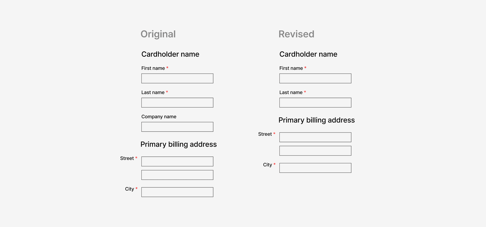
The Expedia form had an optional field labeled "Company," which users mistakenly interpreted as the place to enter their bank name. As a result, users entered their bank's address instead of their home address in the address field, causing credit card verification failures. After removing this optional field, Expedia saw a significant improvement, gaining $12 million in annual profit.
Forms can do more harm than good if they're not thoughtfully designed. Make sure you're measuring conversions over time and keeping an eye out for UI/ UX mistakes that prevent form viewers from providing accurate data.
Why? Forms are an afterthought
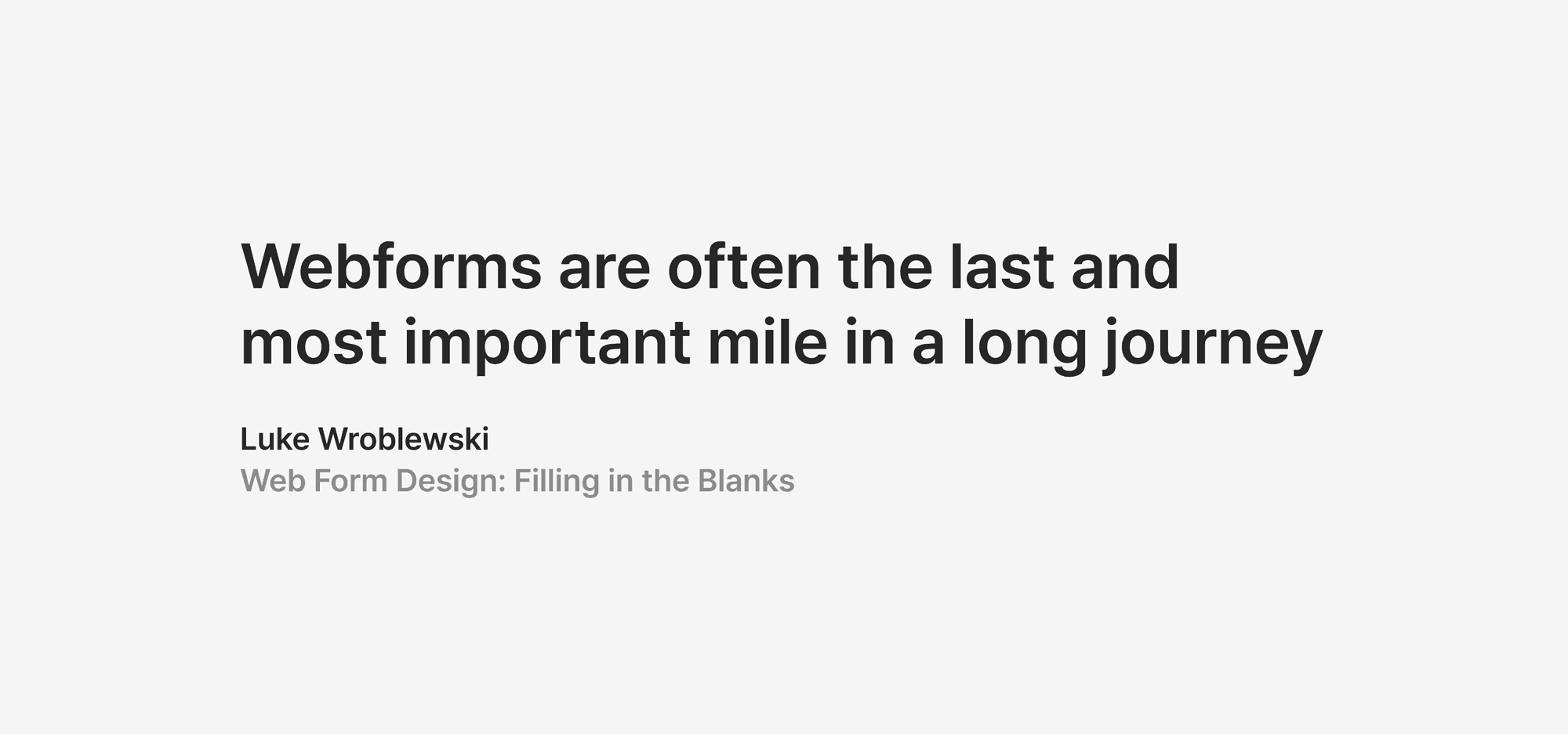
Luke Wroblewski — the grandfather of Web form design said:
If you’re a founder, marketer, or web designer, you probably understand the importance of having a high-converting website. But think back to the last time you built one of these critical business tools and realized a few days before launch that you needed a contact form or a "Book a Demo" page. You or your developer probably just threw something together at the last minute, right?
No wonder so many prospects are lost due to poorly designed forms. This neglect happens because forms are often seen as just another website component rather than a crucial part of conversion strategy. But when thoughtfully designed with the visitor’s journey in mind, they do more than just collect names — they qualify leads, reveal customer intent, and guide prospects smoothly down the funnel.
Let’s deconstruct popular forms
We've just seen how throwing together a last-minute form can leave gaps in your customer acquisition funnel. Now, let's break down some popular "Contact Sales" forms to understand what works, what doesn't, and how you can avoid common pitfalls.
The most common forms on sites (for contact sales, book a demo, etc) follow the below patterns. Here are some examples from Framer and Webflow:
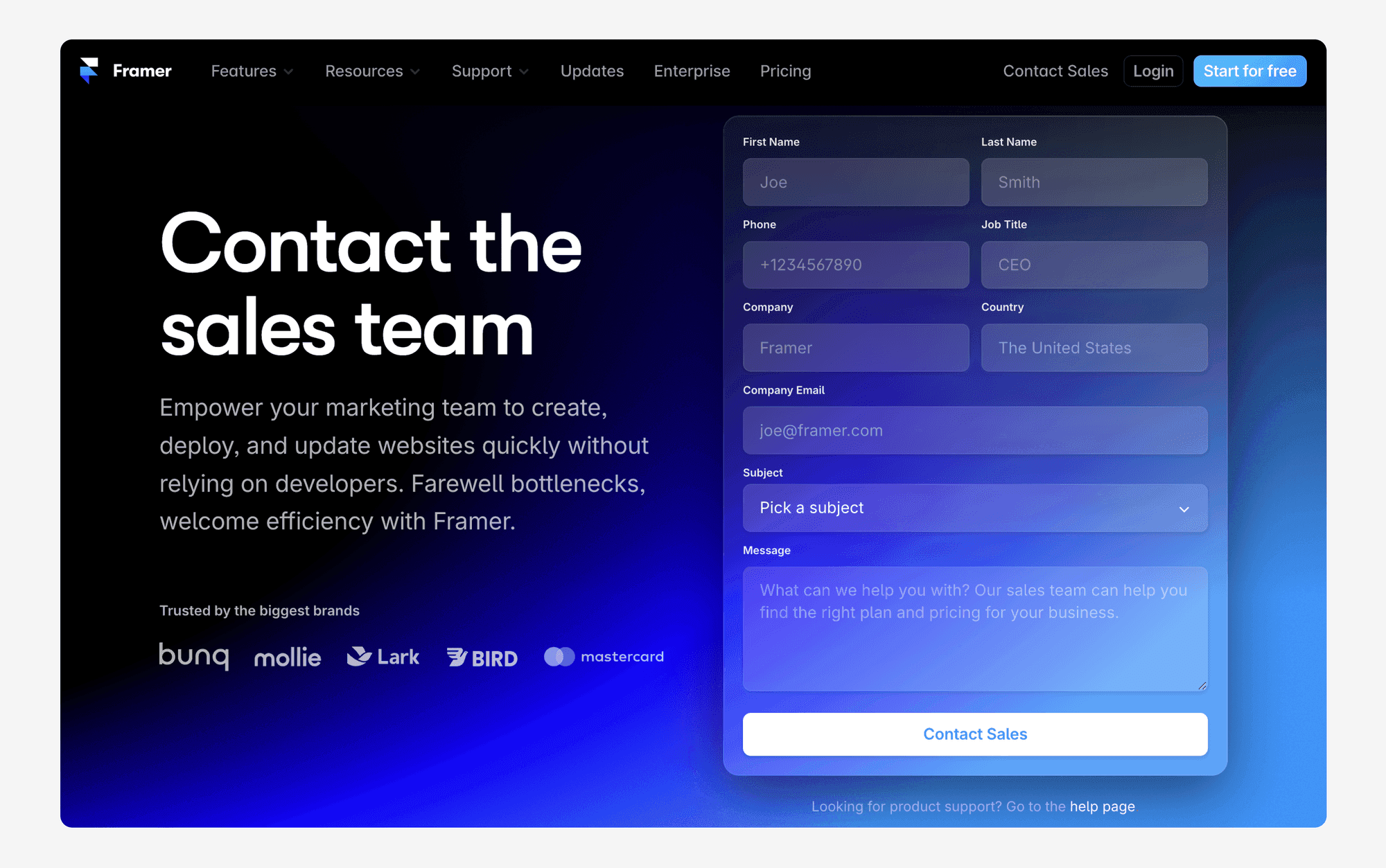
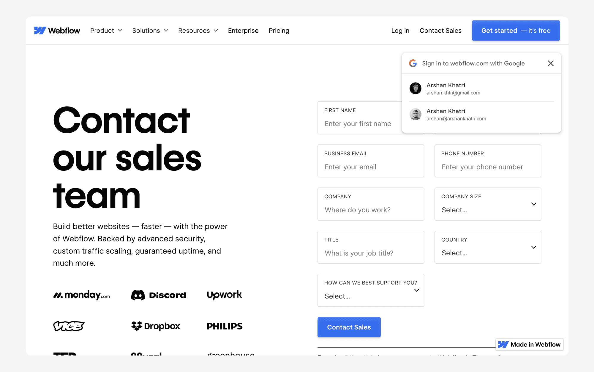
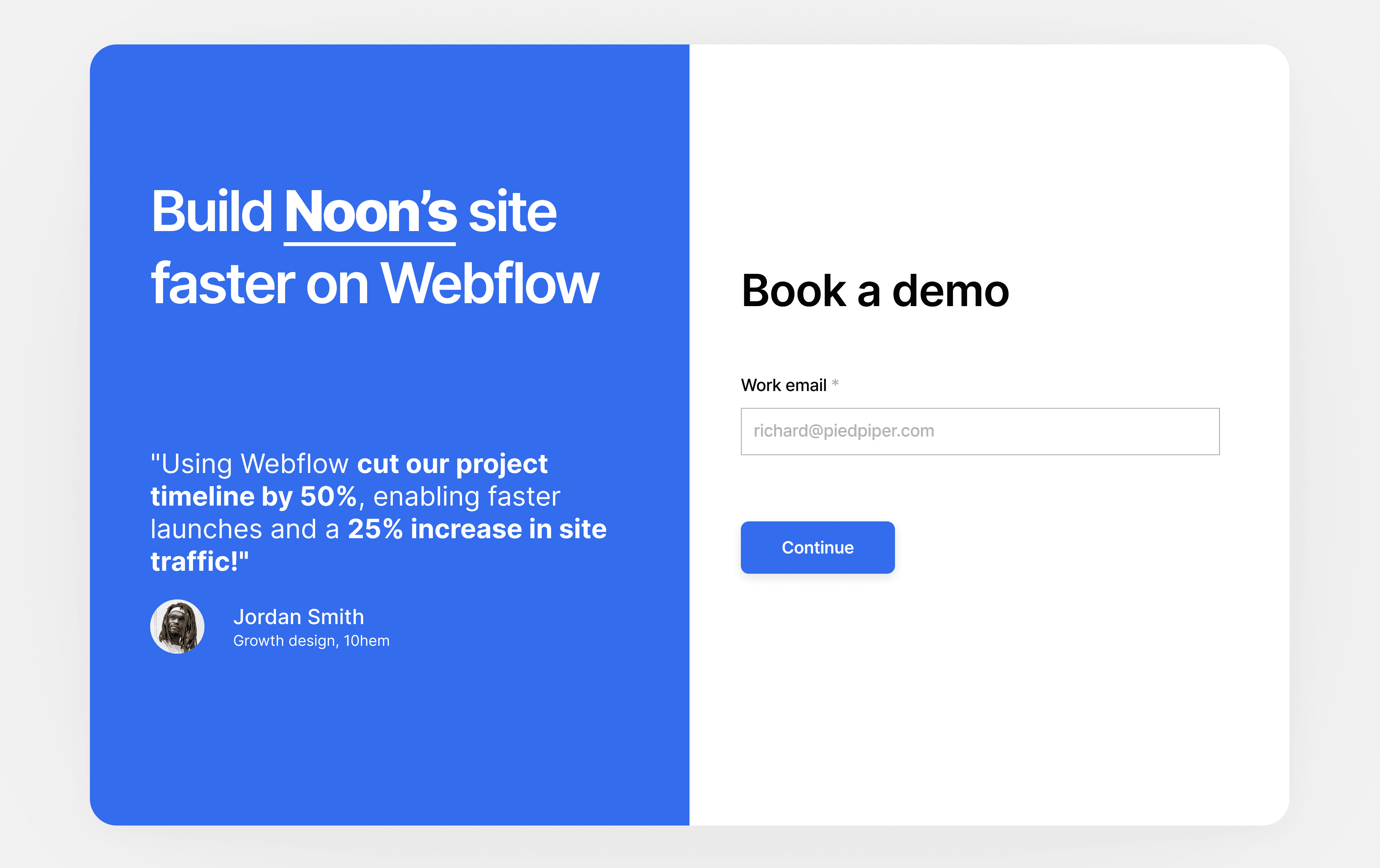
Both site forms have visually appealing layouts with heading, body text along with social proof (nice!) and an inline form with questions, typical of nearly every HubSpot, Pardot, and Marketo form you've probably seen on most business websites.
Here’s a breakdown of some key elements on these pages:
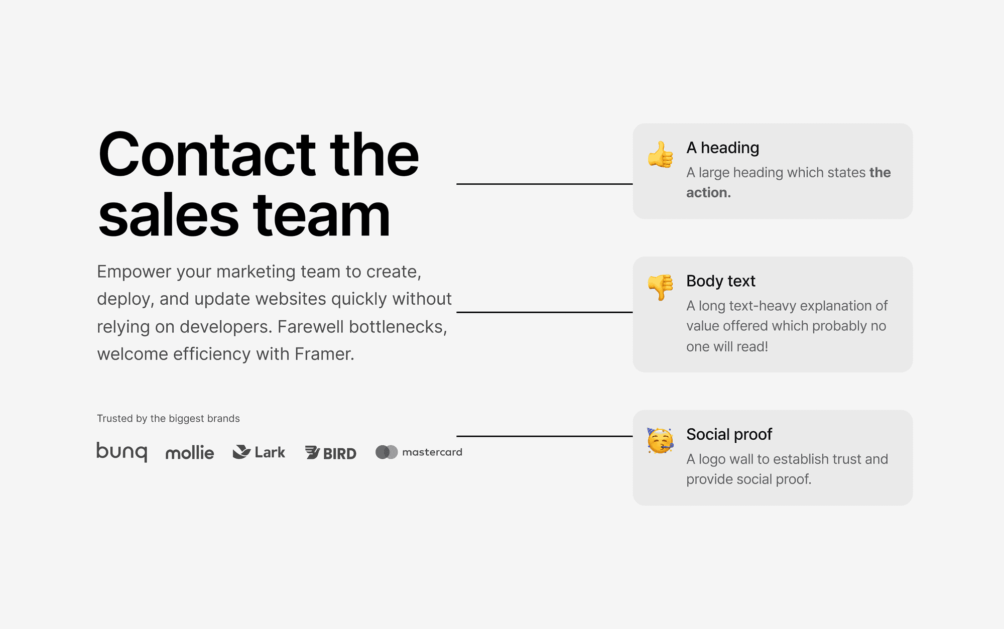
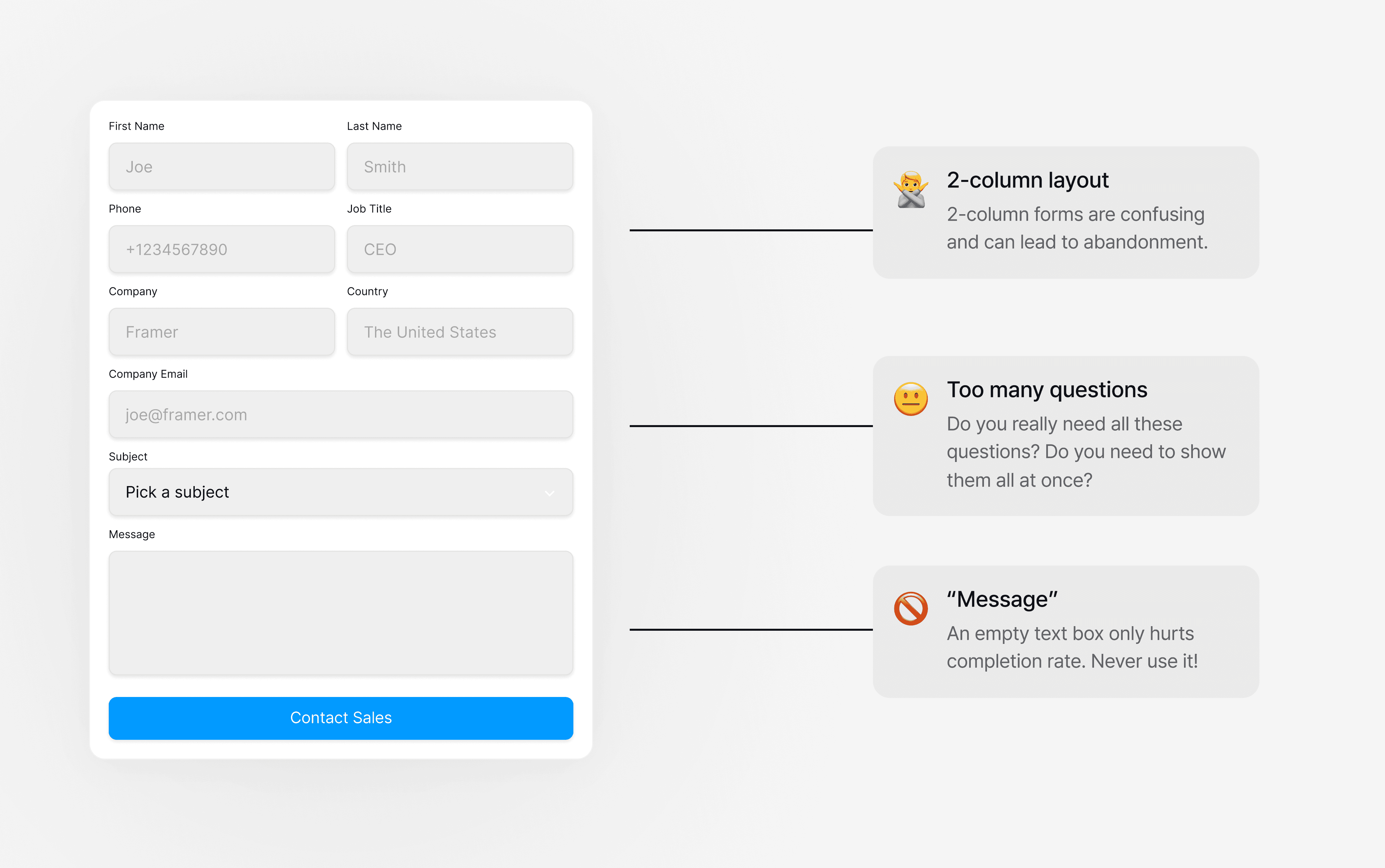
These type of pages and forms may work well if the goal is to get more qualified leads but they come at the expense of conversions. If the goal is to maximize conversions and data collection, then these forms require some reconstruction.
Let’s reconstruct them
Before diving into the form redesign, it's essential to adhere to some basic best practices that enhance user experience and improve form functionality:
Inline Validation: Instantly confirm correct inputs like email formats.
Mobile Optimization: Ensure forms are easy to use on mobile devices.
Minimize Fields: Limit fields to essential information only.
Clear Error Messages: Provide specific guidance for correcting errors.
Having these best practices in place sets the stage for deeper improvements. Below are some ways to modify these forms when the goal is to increase data collection and completion rates.
Create multi-step forms: Multi-step forms are known to boost conversions by making the process less overwhelming. Multi-step forms also enable partial data collection, ensuring that even if a visitor doesn't complete the entire form, valuable data is still captured. Of course, this must be done in a privacy-compliant way.
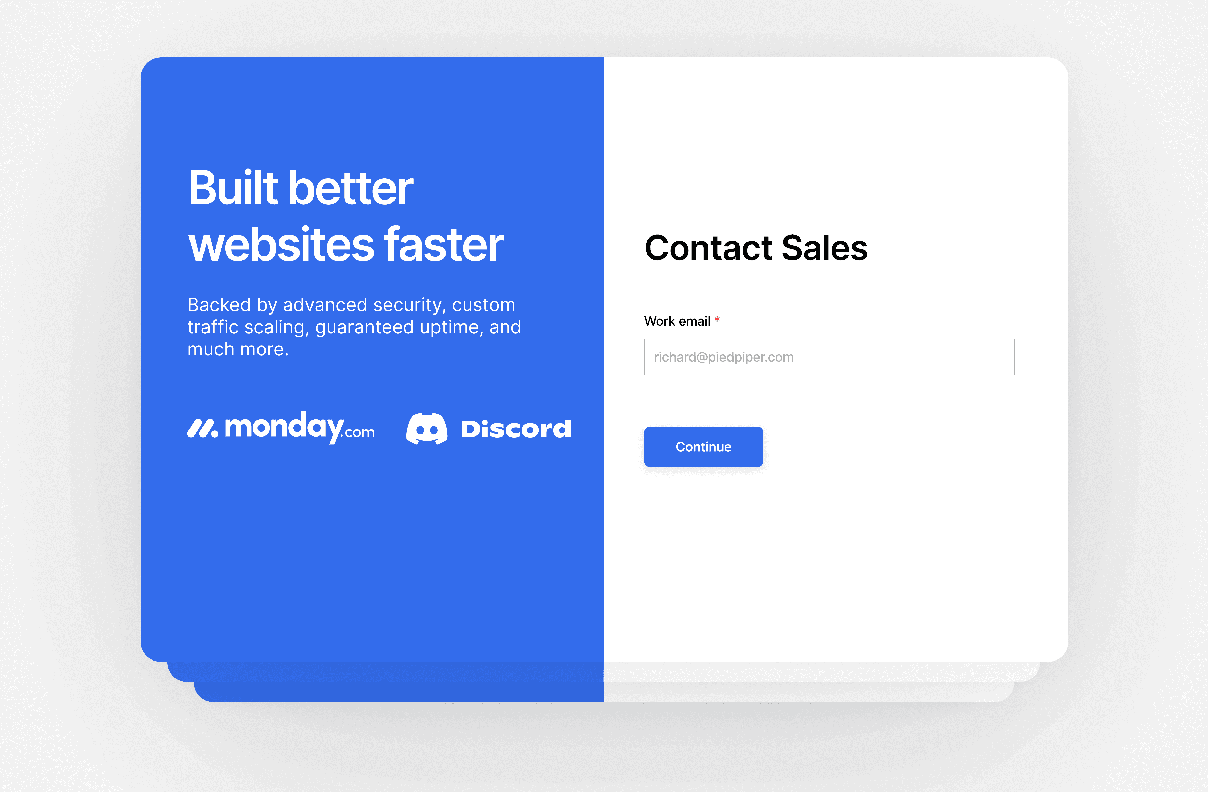
Gamify the Experience: Build quizzes into your forms to boost engagement, collect first-party qualification data for your sales team, and demonstrate your value prop. Asking multiple choice quiz questions before collecting identity information shows viewers that you understand a customer's primary needs and are aligned with solving their pain points.
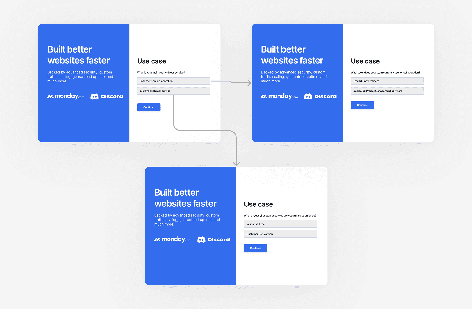
Add relevant page context: Align page content with the user's journey. For instance, if a visitor arrives via an PPC ad for "Build enterprise forms faster," the form page should highlight features or testimonials relevant to an enterprise audience. Moreover, consider mentioning something about the visitor/ their company (e.g. detected using data enrichment providers).
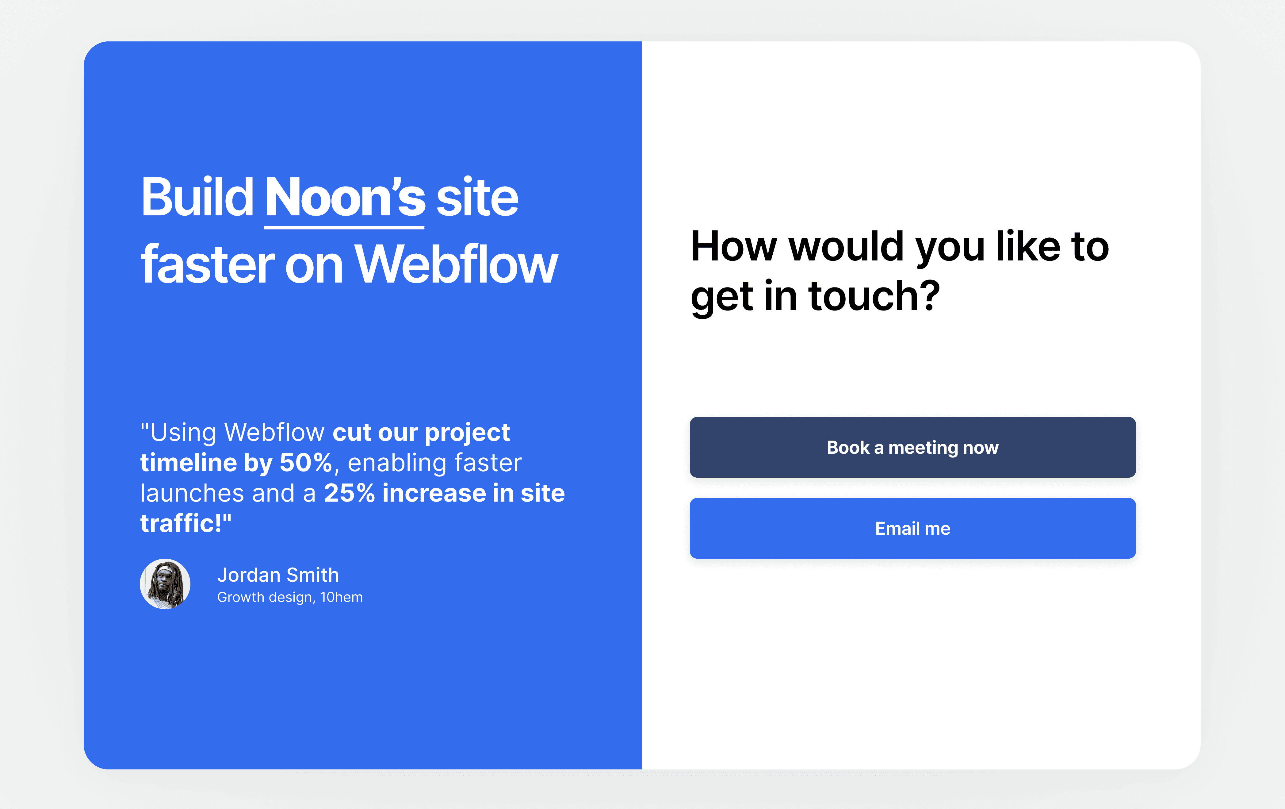
Explicit Contact Preferences: Offer visitors a choice on their preferred communication method (e.g. book a meeting, email, phone). This customization provides customers with optionality while reducing the risk of drop-off.
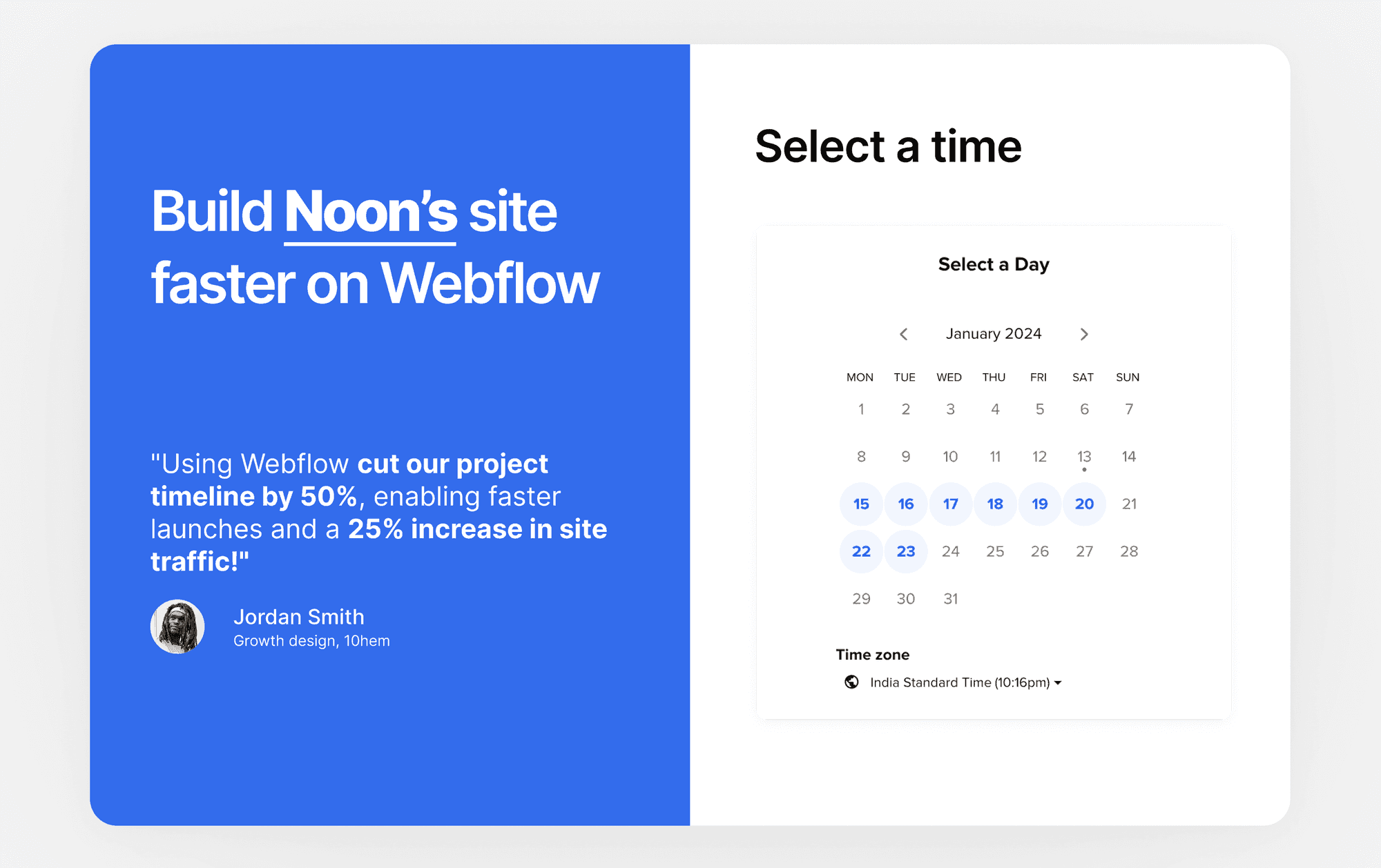
Embed Scheduling Options: Include scheduling options in the form for certain qualified visitors, allowing them to book a demo or consultation as part of the form completion process, facilitating a seamless transition to sales engagement.
Let’s recap!
People hate filling out forms so include only questions necessary for qualification and getting in touch.
Forms can end up hurting site conversions due to poor design.
Treat forms as an opportunity for continually optimizing conversions and not just as an afterthought.
Follow basic best practices and implement multi-step forms, gamification, and built-in scheduling.
Thoughtful form design can help make sure that your inbound marketing efforts aren't dropping qualified leads. You can turn your simple forms into powerful tools for generating leads and driving conversions with all of the techniques discussed above with Surface Labs today!
Customer Stories
Learn from the best marketing teams


Galley Solutions Boosted Lead Quality and Cut Demo Prep Time with Surface.
30%
100%
37%
70%
"We actually saw that 37% more users on average converted with the new form that they built for us."

Alexandra Doan
Growth Marketing Ops, Nextiva

5.8k+
7K+
Juicebox Scaled Viral Inbound Demand with Surface Labs

11k+
82%
Kintsugi Prevented Fake Leads from Spamming their Sales Calendar.

30%
95%
Numbers Station Boosted Pipeline by 30% with Surface Labs.
Resources
Templates, guides, and insights that drive results


